Grovia design system
Design system
An inventory of the colours, text styles, shapes, layout rules, motion and components that make up the Grovia site. Treat it as the source of truth when building a new section or page.
How to use this page
Read the whole page before you build. Every value below already exists in the project, so reuse it instead of inventing a new one.
Never hard code a colour or a font size. Apply the colour style and text style by name.
Build every new section as Section then Container then content, exactly as described in section 04.
Use a component from section 09. If the pattern you need is missing, assemble it from existing components before creating anything new.
Match the padding and gap ladder in section 04 on all three breakpoints.
Check your work at 1200px, 810px and 390px before you finish.
Desktop
1200px
min-width: 1200px
Tablet
810px
810px to 1199.98px
Phone
390px
max-width: 809.98px
01
Color guide
Apply colour as a style, never as a raw hex value. The Light Theme ramp carries all text, borders and light surfaces. Background holds the page and section surfaces. Main and UI are reserved for small accents.
Light Theme
Neutral 00
#FFFFFF
Card and panel surfaces, text on dark fills.
Neutral 01
#FAFAFA
Subtle surface tint one step off white.
Neutral 02
#F4F4F4
Light tint for inset areas.
Neutral 03
#EEEEEE
Light tint and dividers on white.
Neutral 04
#E6E6E6
Default 1px border on cards and inputs.
Neutral 05
#DADADA
Stronger border and disabled edges.
Neutral 06
#CCCCCC
Inactive icon and control strokes.
Neutral 07
#BDBDBD
Placeholder and disabled text.
Neutral 08
#AEAEAE
Muted icons on light surfaces.
Neutral 09
#999999
Low emphasis meta text.
Neutral 10
#605F5F
Secondary body copy and descriptions.
Neutral 11
#1A1A1A
Near black for soft dark surfaces.
Neutral 12
#000000
Default text colour and primary button fill.
Dark Theme
D - Neutral 00
#000000
Base surface for dark sections.
D - Neutral 01
White 5%
Hairline fill on dark.
D - Neutral 02
White 10%
Borders and dividers on dark.
D - Neutral 03
White 15%
Hover fill on dark.
D - Neutral 04
White 20%
Pressed fill on dark.
D - Neutral 05
White 30%
Inactive strokes on dark.
D - Neutral 06
White 40%
Muted surface on dark.
D - Neutral 07
White 50%
Disabled text on dark.
D - Neutral 08
White 60%
Low emphasis text on dark.
D - Neutral 09
White 70%
Secondary text on dark.
D - Neutral 10
White 80%
Body copy on dark.
D - Neutral 11
White 90%
Near white headings on dark.
D - Neutral 12
#FFFFFF
Primary text on dark surfaces.
Main
Yellow
#FEF7AF
Brand highlight. Yellow button fill and accent surfaces.
Background
BG 01
#F4F2EE
Page background on every page.
BG 02
#F0ECE6
Card and inset surfaces inside sections.
BG 03
#EDE9E6
Third surface step for nested cards.
UI
Pink
#F7A49E
Accent inside UI mockups and illustrations.
Blue
#84E6F6
Accent inside UI mockups and illustrations.
Yellow
#FECD1A
Rating stars and warning accents.
Red
#E83043
Error and destructive states.
Overlay
Overlay 01
Black 30%
Light scrim over imagery.
Overlay 02
Black 68%
Heavy scrim behind overlays and menus.
Rules for agents
Text defaults to Neutral 12. Use Neutral 10 for secondary copy and descriptions.
Page background is BG 01. Section surfaces that need to separate from the page use BG 02.
Borders are Neutral 04 at 1px unless the element sits on a dark fill, where D - Neutral 02 is used.
Main Yellow and the UI colours are accents only. Never set body copy or a primary button in them.
Neutral 12, Neutral 00 and Neutral 04 also appear at the root of the panel as legacy duplicates. Always pick the Light Theme entry.
02
Typography guide
Two families carry the whole site. Albert Sans sets every heading and the tag style, Geist sets body copy and interface labels. Sizes below are Desktop / Tablet / Phone and are already built into each style, so never override a font size by hand.
Heading 1
Albert Sans 400
56 / 50 / 36 px
Letter spacing -0.05em
Line height 1.1em
Tag h1
Page title. Once per page.
Strategy and growth for modern teams
Heading 2
Albert Sans 400
40 / 36 / 30 px
Letter spacing -0.05em
Line height 1.1em
Tag h2
Section title.
Built for high performance
Heading 3
Albert Sans 400
36 / 28 / 24 px
Letter spacing -0.05em
Line height 1.3em
Tag h3
Large sub title and feature headline.
Powerful integrations
Heading 4
Albert Sans 400
30 / 26 / 22 px
Letter spacing -0.04em
Line height 1.3em
Tag h4
Card headline and pricing plan name.
Flexible pricing
Heading 5
Albert Sans 400
26 / 24 / 20 px
Letter spacing -0.04em
Line height 1.3em
Tag h5
Small card headline and metric value.
Easy setup
Heading 6
Albert Sans 400
20 / 20 / 18 px
Letter spacing -0.04em
Line height 1.3em
Tag h6
List row title and FAQ question.
Track growth
Body
Geist 400
16 / 16 / 16 px
Letter spacing -0.03em
Line height 1.4em
Tag p
Default paragraph copy.
Grovia helps teams plan, launch and measure the work that moves the business forward.
Body L
Geist 400
18 / 18 / 18 px
Letter spacing -0.03em
Line height 1.4em
Tag p
Lead paragraph under a page title.
Grovia helps teams plan, launch and measure the work that moves the business forward.
Body S
Geist 400
14 / 14 / 14 px
Letter spacing -0.03em
Line height 1.4em
Tag p
Captions, meta data and fine print.
Grovia helps teams plan, launch and measure the work that moves the business forward.
Body (Light)
Geist 400
16 / 16 / 16 px
Letter spacing -0.03em
Line height 1.4em
Tag p
Paragraph on a busy surface. Neutral 10 by default.
Grovia helps teams plan, launch and measure the work that moves the business forward.
Label
Geist 500
16 / 16 / 16 px
Letter spacing Default
Line height Default
Tag p
Short emphasised label inside a card.
Most popular
Button
Geist 500
16 / 16 / 16 px
Letter spacing Default
Line height 1.1em
Tag p
Button and call to action labels only.
Get started
Tag
Albert Sans 500
12 / 12 / 12 px
Letter spacing -0.03em
Line height 1.2em
Tag p
Pills and eyebrows. The only uppercase style.
Case study
Nav
Geist 500
16 / 16 / 16 px
Letter spacing Default
Line height Default
Tag p
Primary navigation links.
Pricing
Nav Footer
Geist 400
18 / 18 / 18 px
Letter spacing Default
Line height Default
Tag p
Footer navigation links.
Contact us
Rules for agents
Apply a text style by name. Never set fontSize, fontWeight or letterSpacing inline.
Heading 1 appears once per page, inside the opening section. Every other section title is Heading 2.
Keep the semantic tag that comes with the style so the page keeps a correct heading order.
Sizes already respond across breakpoints. Do not add a per breakpoint font size override.
Misc./Tag is the only uppercase style in the system. Everything else is sentence case.
Secondary copy uses Body with Neutral 10, or Body (Light) which carries that colour already.
03
Shape and surface
Repeating shape values across the site. Corner radius, padding, border and shadow are drawn from the short scales below. Pick the nearest value on the scale rather than inventing a new one.
Corner radius
10px
Small inline chips inside UI mockups.
12px
Icon tiles and inputs.
16px
Default card radius. The most used value on the site.
20px
Medium cards and image frames.
24px
Large cards and media blocks.
28px
Tablet and phone step down from 32px.
32px
Full width section wrap and the primary button.
40px
Pills, avatars and the arrow capsule inside a button.
Padding scale
4px
Inset frame around a nested ticker or image.
8px
Icon buttons and compact pills.
12px
Tight inline controls.
16px
Small card padding.
20px
Default small card padding.
24px
Medium card padding.
28px
Large card padding. Common on feature and case cards.
32px
Generous card padding.
Border
1px solid Neutral 04
Default card, input and divider stroke.
2px solid Neutral 00
White keyline around an image on a tinted surface.
1px dashed Neutral 04
Placeholder and empty state only.
Shadow
Card lift
5px 8px 15px 0px rgba(0,0,0,0.15)
Default lift on cards and floating UI mockups.
Button
0px 5px 15px 0px rgba(0,0,0,0.2)
Primary black and yellow buttons.
Soft
0px 8px 20px 0px rgba(0,0,0,0.1)
Subtle lift on light cards.
Warm glow
0px 1px 20px 0px rgba(224,215,198,0.5)
Soft halo behind light surfaces on the warm background.
Button anatomy
Main (filled)
Height 44px
Radius 32px
Padding 8px 8px 8px 16px
Gap 12px between label and arrow
Arrow capsule radius 40px with a 28px icon
Shadow 0px 5px 15px 0px rgba(0,0,0,0.2)
Transition spring physics 218 30 1
Outline
Height auto
Radius 32px
Padding 12px 20px 12px 20px
Border 1px solid Neutral 12
Transparent fill
Arrow capsule hidden
No shadow
Rules for agents
Cards use radius 16px, padding 20px to 28px, fill Neutral 00 or BG 02, and a 1px Neutral 04 border.
Buttons use radius 32px. Pills, avatars and the arrow capsule use radius 40px.
Step radius down on narrow breakpoints only where the site already does it, for example 32px to 28px on a full width section wrap.
Use one shadow per element. Card lift for cards, Button for buttons. Never stack shadows.
Pick the nearest value on these scales. Do not introduce a new radius or padding number.
04
Container and layout
Every section on the site is built as Section then Container then content. The Section spans the viewport and carries no horizontal padding. The Container holds the max width and all padding. Copy this contract exactly.
The contract
Section: width 1fr, height auto, vertical stack, centre aligned, gap 10px, overflow hidden, html tag section. Use header for the opening section.
Section carries an element id in lower case with hyphens so in page links can target it.
Container: width 1fr, max width 1200px, height auto, vertical stack, overflow hidden. All horizontal padding lives here.
Content sits inside the Container. Never place content directly on the Section.
A full bleed band is the only exception. It puts a small padding on the Section and uses a Section Wrap child with a radius instead of a max width Container.
Container padding by breakpoint
Standard section
80px
80px 64px 80px 64px
80px 24px 80px 24px
Opening section
100px 80px 0px 80px
100px 64px 0px 64px
40px 24px 0px 24px
Opening section outer
80px 0px 0px 0px
80px 0px 0px 0px
80px 0px 0px 0px
Full width band section, see 06
0px 20px 0px 20px
0px 20px 0px 20px
0px 4px 0px 4px
Container gap by breakpoint
Opening section
80px
64px
80px
Section header plus content
40px
40px
40px
Case studies and testimonials
64px
40px
64px
Stacked steps
0px
0px
0px
About page content
80px
80px
64px
Team grid
80px
40px
64px
Case study index wrap
64px
64px
64px
Direction changes on narrow breakpoints
Integration
Horizontal, space between
Horizontal, space between
Vertical, centred
FAQ
Horizontal, space between
Vertical, start
Vertical, start
Team
Horizontal, space between
Vertical, start
Vertical, start
Rules for agents
Set the Container padding and gap on all three breakpoints. A section that only carries the desktop value is not finished.
Horizontal padding steps 80px to 64px to 24px. Vertical padding of 80px holds on desktop and tablet and only changes on the opening section.
Never put a max width on the breakpoint itself. The Container owns it.
When a horizontal Container becomes one column on a narrow breakpoint, switch that Container to a vertical stack rather than only shrinking the gap.
Text inside a vertical stack uses width 1fr. Compact controls like buttons and pills use width auto.
05
Section patterns
The repeating shapes a page is assembled from. A new page is a stack of these patterns in this order. Keep the opening section first and keep one Heading 1 on the page.
Home page order
Opening
header
Page title, lead copy, buttons and a UI mockup
Process
process
Section header plus the Steps component
Feature
feature
Section header plus the Feature Tab component
Integration
integration
Two column split with a logo ticker
Pricing
pricing
Full width band holding the Pricing component
Case and testimonial
case-studies
Case study list plus testimonials
FAQ
faq
Two column split, heading left and questions right
Standard section anatomy
Opening section: html tag header, Page Header or a hand built title block, then the supporting visual. It is the only section that uses Heading 1.
Content section: the Section Header component at the top of the Container, then the content block below it, with a 40px gap between them.
Section Header has a Center variant and a Left variant. Centre for full width content, left for a split layout.
Split section: a horizontal Container with space between, a text column on one side and content on the other, switching to a vertical stack on phone.
Band section: a full width Section Wrap with a radius and an image fill, used once per page at most. Section 06 specifies it in full.
Closing section: the Contact Section component, followed by the shared footer from the layout template.
Other pages
/about
Page Header component
About content, metrics and the team grid
/case-studies
Page Header component
A page wrap container with a 64px gap holding the case study list
/case-studies/:Case Study
Case study title block
Alternating rich text and gallery blocks, then more case studies
/404
Short title block
A single message and one button back to the home page
Rules for agents
Open every page with the opening section pattern and carry the only Heading 1 there.
Give every section an element id so navigation and in page links keep working.
Alternate full width content with split content so a page does not read as one long column.
Use at most one full width band per page.
End every page with the Contact Section component before the shared footer.
06
Full width band
The one sanctioned exception to the Section then Container rule. A band is a rounded, image backed panel that sits almost edge to edge and turns the surface dark. It adds a third level and an overlay. Use it at most once per page.
Where it is used
Pricing
/home
A hand built section on the page
Contact Section
/home and /about
The same structure, built inside the component
Anatomy
A working band at real values. The outer frame is the Section and owns the gutter. The rounded panel is the Section Wrap and owns the image and the radius. The Overlay is pinned over the image, under the content.

Container
Content sits here
Max width 1200px, 64px vertical and 60px horizontal padding, z index 1. Every text layer switches to Dark Theme tokens.
Inner card
Overlay 01 at a 24px radius with 32px padding. Translucent, never a solid neutral.
Layer settings
Section
Controls the bleed. It sets the gutter and nothing else.
html tag section, width 1fr, height auto, vertical stack centred, gap 10px, padding 0px 20px, no max width, overflow hidden
Section Wrap
The visible surface. It carries the image and the radius.
html tag section, width 1fr, height auto, horizontal stack centred, gap 10px, image fill, radius 32px, overflow hidden
Container
The content. The only layer with a max width.
width 1fr, max width 1200px, padding 64px to 80px vertical and 60px horizontal, z index 1
Overlay
Darkens the image so text stays legible.
absolute, left right top and bottom all 0px, fill Overlay 02, z index 0, no layout
How the band changes on breakpoints
Section gutter
0px 20px
0px 20px
0px 4px
Section Wrap radius
32px
28px
28px
Container padding
80px 60px
80px 44px
64px 24px
The phone gutter drops to 4px, not the usual 24px. The band is the only pattern on the site that nearly bleeds to the viewport edge on phone.
Colour on a band
The overlay is Overlay 02, rgba(0, 0, 0, 0.68). It is heavy on purpose: the image survives as a faint wash, not as a picture. Do not lower it to show more of the image.
A band is a dark surface. Headings use D - Neutral 12, supporting copy uses D - Neutral 09. Light theme neutrals are never correct inside a band.
Cards inside a band use Overlay 01, rgba(0, 0, 0, 0.3), at a 24px radius with 32px padding.
Main / Yellow is the only accent on a band, and only on the primary button.
The band is the only place where the page background token is not visible behind the content.
Band images
Both bands use a soft abstract motion blur. Shown here raw. On the page each one sits under Overlay 02, so only a faint colour wash survives.
Pricing band
2400 x 1600. Blue field with a pink and orange bloom.

Contact band
1200 x 800. Red and blue vertical streaks.
RULES FOR AGENTS
Use a band at most once per page, and never two in a row. The closing Contact Section already is one, so a second band on the same page needs a reason.
Never move the gutter onto the Section Wrap. The Section owns the gutter, the Wrap owns the surface.
Always pair the image fill with the Overlay layer. An image fill on its own fails contrast.
Keep overflow clipped on the Section Wrap or the radius will not cut the image.
Switch every text layer inside the band to Dark Theme tokens. Leaving light theme text on a band is the most common failure.
Do not normalise the 4px phone gutter to the usual 24px.
Reuse an existing band image from section 10. Do not introduce a new photograph for a band.
07
Motion and effects
Motion on this site is one shared rule, not a per section decision. A single all pages effect reveals every layer as it enters the viewport. Do not add appear effects to anything you build.
The shared reveal
Opacity
0
0
Y offset
5%
0%
Mask
Wipe, 270 degrees, 30% width
Wipe, 270 degrees, 30% width
Transition
Spring duration 1s, bounce 0.2
Spring duration 1s, bounce 0.2
Scope
All pages, set once on the home page primary breakpoint
All pages
Interaction
Buttons animate with a spring physics transition of 218 stiffness, 30 damping and mass 1. This lives inside the Button component, so an instance needs nothing added.
Interactive components carry their own hover and touch variants. Switch the variant, do not add a hover effect to the instance.
Page transitions use a spring duration of 0.4s with a bounce of 0.2.
Rules for agents
Do not set an appear effect on a new section, card or text layer. The all pages effect already covers it.
Do not change or remove the all pages effect while building a section.
The opening section on the home page is hand tuned and is the only place with per layer effects. Do not copy it.
If a layer genuinely needs to move on scroll, raise it with the user first rather than adding a one off effect.
08
Writing style and tone
Plain, confident and short. The site talks about outcomes for a team rather than features of a product. Sentence case everywhere, with one uppercase style reserved for tags.
Case by element
Headings
Sentence case
Strategy and growth for modern teams
Section titles
Sentence case
Your questions, answered
Body copy
Sentence case
Securely link your account
Buttons
Sentence case
Get started
Navigation
Sentence case
Pricing
Tags and eyebrows
Uppercase from the Tag style
CASE STUDY
Labels and meta
Sentence case
Most popular
Voice
Lead with the outcome. Headings name what a team gets, not what the product does.
Keep a heading to a single line on desktop, roughly six words or fewer.
Body copy runs one to two sentences. Expand only on a detail page.
Use the second person. Say your team, your account, your workflow.
Numbers stay compact: 50+ partners, 9.2k customers, 4.9 / 5 rated.
Step labels are numbered 01, 02, 03 with a two or three word title above a single sentence.
Avoid
Title Case or ALL CAPS anywhere other than the Tag style.
Em dashes. Use a comma, a full stop or a new sentence.
The not just X, but Y construction.
Exclamation marks, marketing superlatives and words like revolutionary or seamless.
Trailing full stops on buttons, tags, labels and navigation links.
Repeating the section title in the first line of the body copy under it.
Rules for agents
Write every new string in sentence case and let the Tag style do the uppercase work.
Match the length of the copy already in the same pattern. Do not write a longer paragraph than the one you are copying.
Button labels are two to three words and start with a verb.
Keep product and feature names as they already appear on the site.
09
Component list
Every component in the project, one per row, rendered live. Always build with a component from this list. If the pattern you need does not exist, assemble it from these components before creating a new one. The footer, header background and badge are shared chrome and are not listed.
Nav
The site header. Logo, links and a call to action, with a drawer on phone.
Variants: Desktop, Tablet, Phone, Phone Open
Nav Item
A single navigation link. Used in the header and in the footer.
Variants: Nav/Desktop, Footer/Desktop, Nav/Touch Device, Footer/Touch Device
Button
The site button. Filled, outline, text link and nav menu styles with an optional arrow icon.
Variants: Main/Black, Main/Yellow, Outline, Text Link, Nav Menu, plus touch device variants
Tag
A small uppercase pill for a category or an eyebrow.
Variants: Default
Case study
Section Header
The heading block at the top of a section. Eyebrow, title, description and an optional button.
Variants: Center, Left
Page Header
The opening block on an inner page. Heading, subheading and an optional rating.
Variants: Default
Rating
An avatar row with a star rating and a short line of social proof.
Variants: Default



4.9 / 5 Rated
Over 9.2k Customers
Metrics
An animated number with a prefix, a suffix and a short caption.
Variants: Default
0
0
Projects Supported
Helping teams move from idea to execution faster.
Step Card
A single step card with a title, a description and a UI preview. Opens and closes.
Variants: Default/Open, Default/Close, Vertical, Horizonal
01
Easy setup
Create your workspace and invite your team. Get everything ready in minutes.
Step Card UI
The mockup frame shown inside a step card.
Variants: Default


Steps
The three step walkthrough built from step cards.
Variants: Desktop/1, Desktop/2, Desktop/3, Tablet, Phone


Feature Tab Item
One tab in the feature switcher. Active and inactive states.
Variants: Active, Inactive, Inactive/Touch Device
Client portal
Feature Tab UI
The product mockup shown inside a feature panel. One frame per tab.
Variants: 1, 2, 3, 4


Feature Tab Content
The panel beside the feature tabs. Heading, description and a UI preview.
Variants: Desktop, Tablet/Mobile
Feature Tab
The complete feature switcher. Up to four tabs with their panels.
Variants: Desktop/1 to 4, Tablet+Mobile/1 to 4
Integration Step
A numbered line of copy used in the integration list.
Variants: Default
01
Explore 50+ supported integrations
Check List
A single ticked feature line used inside a pricing plan.
Variants: Default
Unlimited projects
Pricing List
A compact list of plans for a narrower column.
Variants: 1, 2, 3
Starter
$24
/ mo
Ideal for early-stage teams who need actionable insights to move forward.
Access to core features
Basic performance reporting
Email support
Strategy onboarding guide
Monthly check-in summary
Pricing
The full pricing block. Up to three plans with features, a rating and a layout switch.
Variants: Desktop/1 to 3, Tablet/1 to 3, Mobile/1 to 3
Case
A case study card. Logo, thumbnail, title, description and year.
Variants: Default, Touch Device


Testimonial
A quote card with a photo, a name and a position.
Variants: Light, Dark
FAQ
A single question and answer row that expands.
Variants: Desktop/Close, Open, Touch Device/Close, Touch Device/Open
FAQ List
A stacked group of FAQ rows.
Variants: Default
What types of companies do you work with?
We partner with startups, small businesses, and growing teams across industries. Whether you're in tech, retail, or services, our solutions adapt to your needs.
How long does it take to see results?
Most clients begin noticing improvements within the first few weeks. For deeper operational changes, we typically see lasting impact within 2 to 3 months.
Can Grovia integrate with our existing tools?
Yes. Grovia is built to work with a wide range of platforms including Slack, Notion, Google Workspace, and more.
Do you offer one-time consultations or ongoing support?
Both. You can engage us for one-time strategy sessions or ongoing advisory support depending on your goals and team needs.
What does onboarding look like?
Our onboarding process is simple and collaborative. We start with a kickoff session, align on goals, and provide a tailored roadmap to guide the next steps.
Team Profile
A team member card. Photo, name and role.
Variants: Default

Sophia Reynolds
Founder & CEO
Social Logo
A small social icon link used in the footer.
Variants: Default, Touch Device
Submit Button
The form submit button with loading, disabled, success and error states.
Variants: Default, Loading, Disabled, Success, Error
Contact Section
The closing call to action section used at the end of every page.
Variants: Desktop, Tablet, Phone
Rules for agents
Place one instance and set its variant per breakpoint. Never duplicate an instance for each breakpoint.
Where a component has a Tablet, Phone or Touch Device variant, switch to it on that breakpoint.
Fill a component through its property controls. Never detach an instance to edit the inside of it.
A component that already carries hover and touch states needs no extra interaction added to the instance.
If a pattern is missing, build it from the components above and keep the naming group it belongs to.
10
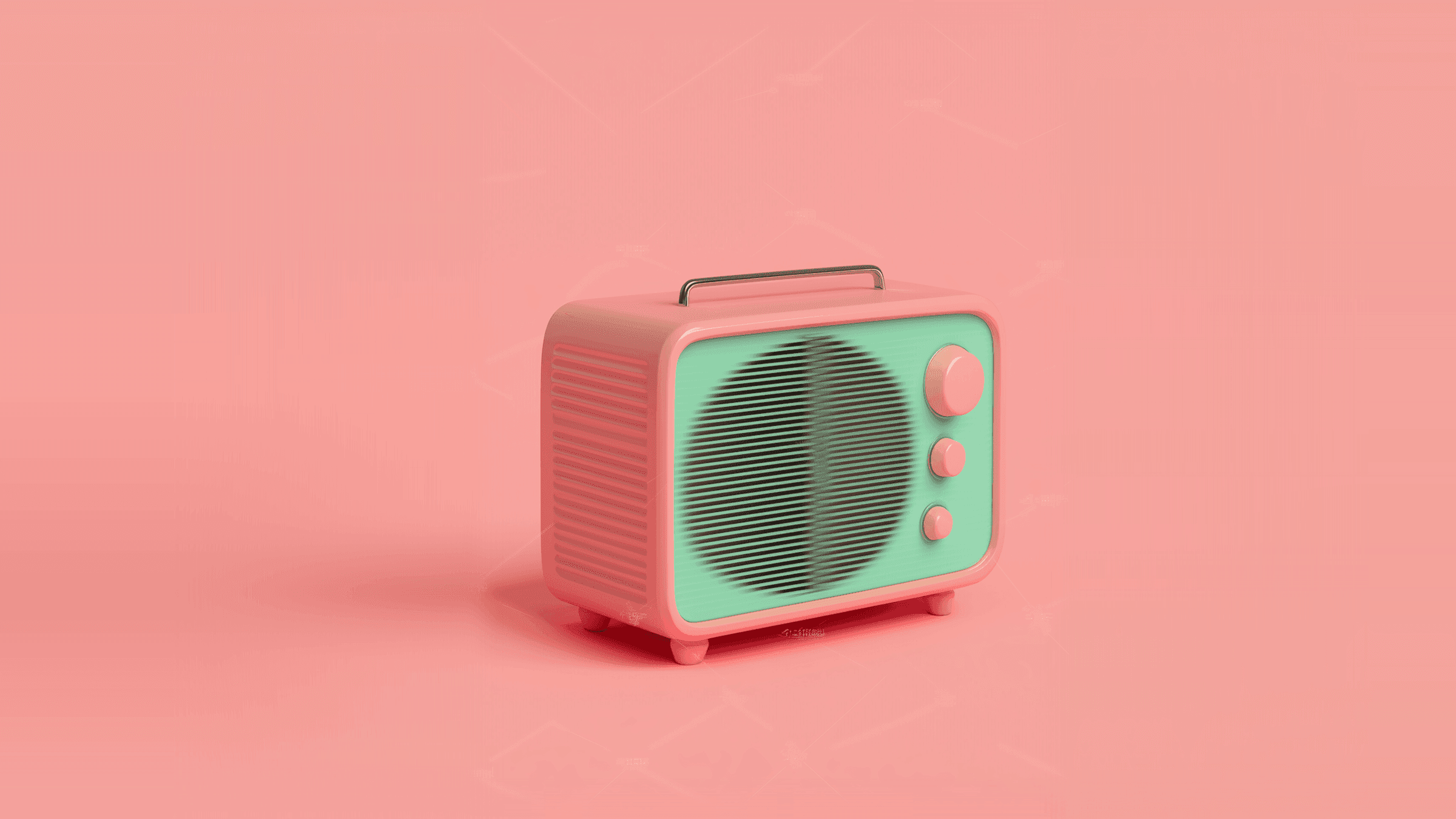
Imagery
The visual language of the site. Warm, soft product mockups and calm abstract surfaces on the off white background. Reuse these assets where they fit before sourcing anything new.



Rules for agents
Images sit in a frame with a 16px to 24px radius and clipped overflow. Never place a raw image without a radius.
On a tinted surface an image carries a 2px Neutral 00 keyline. On a white card it carries no border.
Keep the warm neutral palette. Do not introduce a saturated or high contrast photograph.
Product mockups are centred inside their frame with generous padding around them.
Case study imagery comes from the CMS. Do not hard code it onto a page.
11
Content model
One CMS collection drives the case study work on the site. Any list of case studies must be built from this collection with a collection list, never as static layers.
Case Study collection
Title
String
Card title and the detail page heading
Description
String
Card summary line
Thumbnail
Image
Card image on the index and the home page
Year
String
Meta line on the card
Brand Logo
Image
Client logo on the card
Profile Photo
Image
Author photo on the detail page
Author Name
String
Author credit
Author Position
String
Author role
Content 1
Formatted text
First body block on the detail page
Gallery 1
Gallery
Images after the first body block
Content 2
Formatted text
Second body block
Gallery 2
Gallery
Images after the second body block
Content 3
Formatted text
Third body block
Gallery 3
Gallery
Images after the third body block
More Case Studies
Multi collection reference
Related work at the end of the detail page
Rules for agents
Display case studies with a CMS collection list bound to Case Study. Never duplicate a card and type the content in.
The detail page alternates a formatted text block with its matching gallery. Keep that pairing.
Leave a content and gallery pair empty rather than filling it with placeholder copy.
Do not add a field to the collection without asking first.
Any new list driven content needs its own collection rather than static layers.
12
Icon set
The whole site uses one icon set, Phosphor, at its regular weight. Icons are set through a component control rather than placed by hand, so a new instance inherits the right size and colour.
Arrow Square Right
The arrow inside every filled button.
Chalkboard Simple
Client portal feature tab.
Chart Line
KPI tracking feature tab.
Stack
Workflow automation feature tab.
User List
Team management feature tab.
Pencil Line
Starter plan.
Plant
Growth plan.
Rocket Launch
Scale plan.
Rules for agents
Only use Phosphor. Do not mix in a second icon set.
Set an icon through the icon control on a component. Only place an icon node directly when no component carries one.
Icons render at 28px inside buttons and feature tabs, and at 20px to 24px inline with text.
Icons inherit the text colour around them. Do not give an icon its own accent colour.
Never substitute a unicode arrow or symbol for an icon.